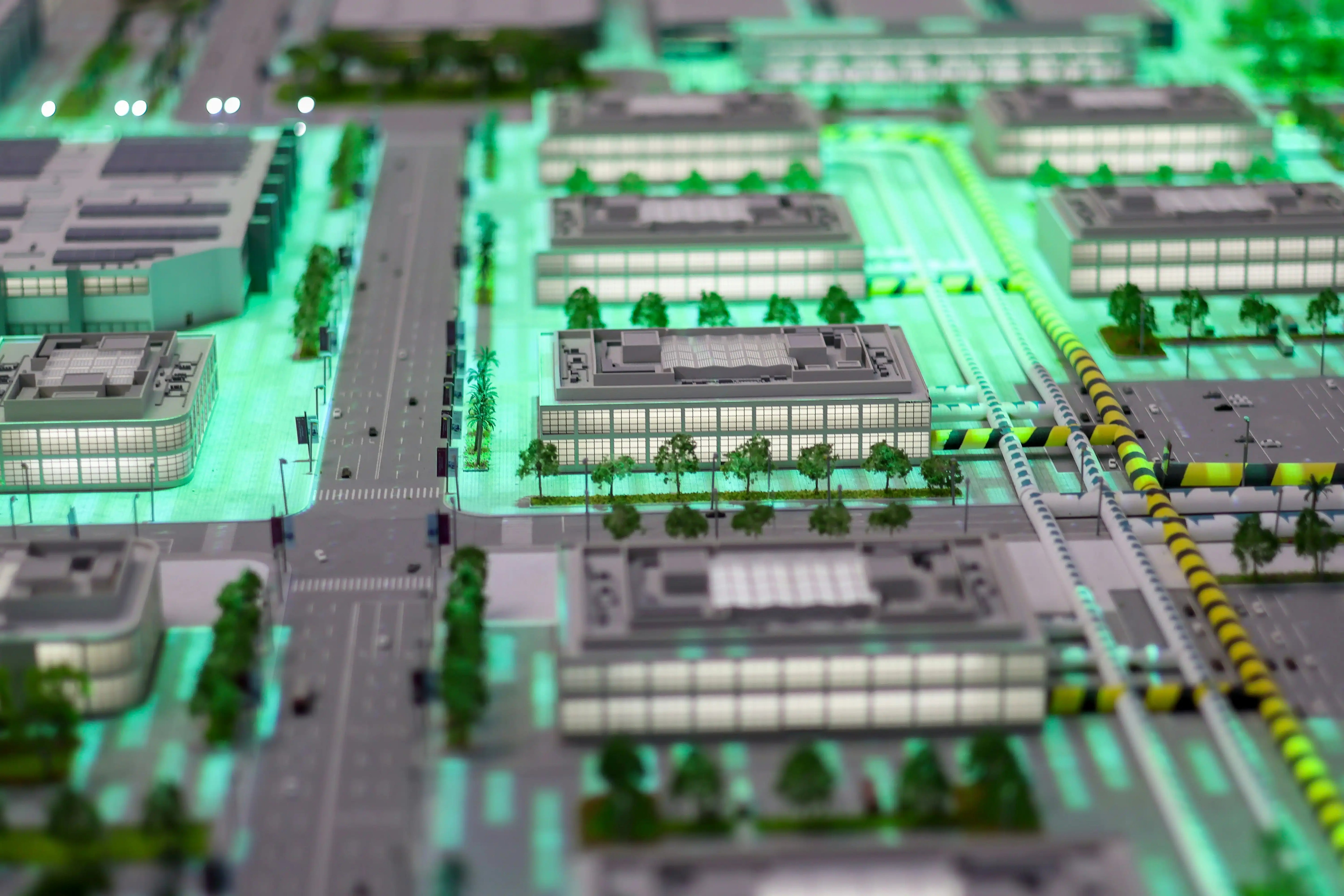
Photorealism isn't an accident, it's a string of deliberate choices. In this guide to realistic architectural visualization and design, we'll walk through a practical, production-ready workflow we use on client projects. From the initial intent to the final grade, we'll cover the steps that make images feel real, not just look polished. Whether we're selling an unbuilt idea or clarifying a design decision, the same principles apply.
Define Intent And Set The Foundation

Narrative And Use Case
Before we touch a polygon, we pin down the story. What must the visualization accomplish, sell units, win a planning review, or test design options? We write a quick brief: target audience, key decision, user journey, and mood in 1–2 sentences. Then we translate that into shots: exterior hero at dusk to show warmth and activity, courtyard daytime to showcase landscape, interior kitchen close-up to communicate craftsmanship.
We also define program and performance cues that drive realism: circulation flows, view corridors, privacy, daylight needs, and how people will actually use the space. If the narrative calls for quiet retreat, we'll avoid crowded scenes and punchy contrast: if it's urban energy, we'll add motion cues, signage, and traffic reflections.
Reference Boards And Real-World Constraints
We assemble tight reference boards: construction details, local materials, regional vegetation, sky conditions, and furniture typologies. We note climate (sun path, overcast vs high-contrast light), building codes affecting sill heights/guardrails, and developer specs (window systems, hardware finishes). Material references include scale, tile sizes, wood plank widths, joint spacing, so our model reads correctly. Constraints sharpen decisions: budget range, maintenance expectations, and supply realities keep materials and fixtures believable.
Build The Scene: Modeling, Materials, And Details

Accurate Scale And Clean Topology
Realism begins with correct dimensions. We model to real-world units from day one, snapping to known sizes: door heights, mullion widths, reveal depths, and glass thickness. We add small bevels/chamfers on edges (0.5–2 mm) so light catches realistically, nothing in the built world is perfectly sharp. Keep topology simple and quads where possible: avoid long, skinny triangles that break shading. Instances for repeating elements (chairs, luminaires, trees) save memory and guarantee consistency.
We model construction logic: window frames sit proud of cladding, slabs have thickness, ceilings accommodate recesses, and baseboards resolve wall-floor junctions. Even subtle slopes for drainage on terraces matter in close-ups.
PBR Materials And UVs
We rely on physically based materials with accurate maps: base color (albedo), roughness, normal, and when needed, displacement. Keep albedo within realistic reflectance (no pure white/black): set Index of Refraction for glass/stone/metal appropriately. We pay attention to scale, UVs in meters, checked against real plank widths and tile grout lines. Break up repetition with variation maps and rotation, and align wood grain with joinery. For metals, separate base metal from painted finishes: for concrete, differentiate board-form vs troweled with micro-roughness and edge wear sparingly.
Contextual Details, Vegetation, And Site Elements
Context sells the shot. We bring in the actual site grade, curb lines, neighboring massing, and plausible street furniture. Vegetation matches climate and species, no tropical palms in a Nordic courtyard. We mix tree/plant assets at multiple ages and sizes, and we vary color/roughness to avoid clone armies. Scatter systems help, but we prune manually near the camera for believable overlaps.
Small cues carry weight: downspouts, drip edges, door thresholds, outlet plates, elevator call buttons, number plates, bike racks. Interior props should reflect the target buyer or user persona: a family kitchen reads differently from a boutique rental. Less is more, every prop should earn its place.
Make It Feel Real: Lighting, Cameras, Color, And Post

Lighting Strategy: HDRI, Sun/Sky, And Fixtures
We choose light to fit the narrative. For exteriors, we start with an HDRI that matches latitude and weather, then layer a physical sun/sky for controllable directionality. Golden hour softens contrasts and adds warmth for sales imagery: overcast mid-day is great for material accuracy. Interiors need a balance: daylight through openings plus real fixture types (downlights, pendants, wall washers) with correct color temperatures and IES profiles. We set exposure in photographic terms (EV, shutter, ISO) so changes are predictable, and we avoid nuking interiors with unrealistic light levels.
Camera Settings, Lenses, And Composition
We treat cameras like real ones. Focal lengths between 24–35 mm feel natural for most architecture: ultra-wide lenses distort scale unless used carefully. Keep verticals vertical, enable 2-point perspective or correct in post. Eye height ~1.5 m for interiors and ~1.6–1.7 m for exteriors keeps viewers grounded. We compose with clear foreground/midground/background, leading lines, and negative space to let materials read. Depth of field is subtle: a hint is fine for close details, but stop down for broader shots to avoid miniature vibes. Add slight camera imperfection: micro tilt, minuscule chromatic aberration, just enough to feel like glass and sensor, not a CAD capture.
Color Management, Rendering, And Post-Production
We work in a linear workflow with proper color management (ACES or calibrated sRGB), lock white balance early, and compare against reference photography. In the renderer, we enable physically based settings, clamp excessively hot values, and use denoising lightly to preserve texture. We render multiple passes (diffuse, specular, emission, cryptomatte, Z-depth) for flexible post.
In post-production, we keep it disciplined: base grade with a filmic curve, controlled contrast, targeted color tweaks, and precise exposure trims. Add atmosphere judiciously (volumetric haze, god rays only when the space warrants). Integrate people carefully, match perspective, light direction, and shadow softness. Avoid heavy-handed LUTs that shift material truth. Final touches: subtle bloom on emissive fixtures, a dash of environmental reflections on glass, and lens dirt only if the narrative benefits.
Conclusion
Realistic architectural visualization and design come from intent, not lucky presets. When we align narrative, model with construction logic, ground materials in physics, and light with a photographer's eye, our images start doing real work, selling ideas, clarifying choices, and building trust. Keep references close, measure everything, and let restraint be your superpower. The result isn't just pretty: it's persuasive.


Comments (0)
Back to Architecture and Design Blog