
Color shapes the way we experience the world, and in architecture, it’s a powerful tool that goes far beyond aesthetics. It influences how we feel in a space, how we interact with it, and even how we remember it. From calming blues in hospitals to vibrant reds in restaurants, every hue carries meaning and purpose.
As designers and inhabitants of these spaces, we’re constantly surrounded by the subtle yet impactful language of color. It can highlight architectural details, create illusions of space, or evoke emotions that align with a building’s purpose. Whether it’s a modern skyscraper or a historic landmark, color choices play a crucial role in defining identity and functionality.
Understanding the interplay between color and architecture helps us create spaces that resonate on a deeper level. Let’s explore how this dynamic relationship shapes our environments and transforms the way we live, work, and connect.
The Role Of Color In Architecture
Color defines spaces, influences behavior, and enhances functionality in architecture. By integrating specific hues, we can create environments that serve both practical and emotional needs.
Shaping Perception and Atmosphere
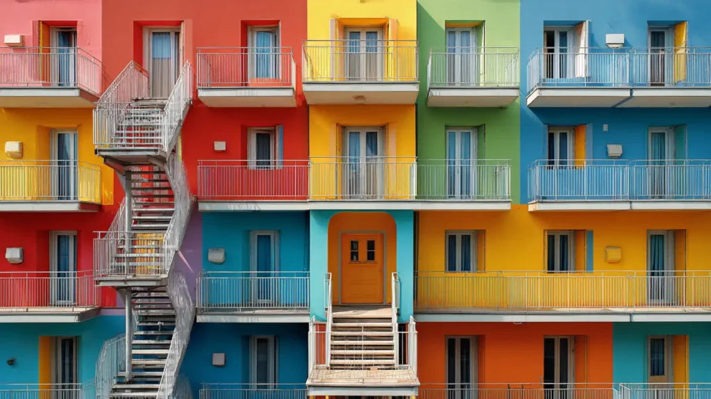
Color significantly impacts how spaces are perceived. Warm tones like orange and yellow foster energy and social interaction, particularly in common areas such as lobbies or recreational spaces. Cool shades like blue and green promote relaxation and focus, making them ideal for libraries, healthcare facilities, or offices.
Defining Purpose and Function
Colors signal the intended use of a space. Educational facilities often employ primary colors to inspire creativity and engagement. Retail environments incorporate vibrant hues to attract attention and boost sales, while industrial spaces use colors like yellow or red for visibility and safety purposes.
Enhancing Cultural and Historical Identity
Architectural color choices often reflect cultural heritage or historical context. Traditional structures in regions like Morocco use earthy reds and ochres to connect with the natural environment, while iconic landmarks like Santorini's whitewashed buildings with blue accents express cultural and climatic considerations.

Influencing Emotional Responses
Strategic use of color can evoke desired emotions. For example, muted palettes in minimalist designs imbue calmness, while bold contrasts create excitement in modern, dynamic spaces. Choosing the right balance ensures a space resonates emotionally with its users.
Facilitating Wayfinding
We use color to establish visual cues and improve orientation. Bright accents in large spaces like airports highlight entrance paths or essential areas, helping users navigate complex layouts efficiently.
Supporting Sustainability and Energy Efficiency
Color enhances environmental performance in architecture. Light-colored exteriors reflect heat in warmer climates, reducing cooling demands. Darker hues retain warmth in colder regions, improving energy efficiency. Material finishes combined with appropriate colors further amplify these benefits.
Historical Influence Of Color In Architecture
Color has shaped architectural practices for centuries, reflecting cultural, religious, and societal values. Its use in structures reveals the priorities and innovations of diverse civilizations.
Ancient Use Of Color In Structures
Ancient architects incorporated natural pigments to enhance their buildings. Egyptian temples showcased deep reds, blues, and golds, symbolizing divinity and eternal life. Greek and Roman structures blended white marble with painted details, adding vibrancy and narrative to their designs.
In Asia, traditional Chinese and Japanese architecture used bold reds, greens, and yellows, signifying prosperity and balance. Indigenous cultures, like the Maya, employed bright hues in pyramids and murals, conveying spiritual and celestial themes.
Evolution Of Color Trends Over Centuries
Color trends in architecture evolved with technological advancements and cultural shifts. The Middle Ages featured earthy tones in Gothic cathedrals, while the Renaissance revived bright palettes in frescoed interiors and facades.
The Industrial Revolution introduced synthetic dyes, leading to pastel-colored Victorian homes. In the modern era, minimalist movements prioritized neutral shades, contrasting with contemporary approaches that embrace bold, experimental tones.
This historical progression illustrates the ongoing relationship between architectural color and societal change.
Psychological Impact Of Color In Architectural Design
Color profoundly influences human psychology, affecting emotions, behavior, and spatial perception. Architectural design leverages these effects to create environments that align with the intended purpose and function of a space.
How Color Affects Mood And Perception
Colors evoke specific emotions and can alter how we perceive a space. Warm colors like red, orange, and yellow stimulate energy and activity, making them suitable for dynamic environments such as restaurants and retail spaces. In contrast, cool colors like blue and green promote calmness and focus, often used in healthcare facilities and educational settings.
Light and dark colors affect spatial perception. Lighter shades make rooms feel larger and more open, while darker hues create a sense of intimacy and coziness. Bright colors attract attention and energize spaces, while muted tones enhance tranquility and sophistication. Architects often consider how natural light interacts with color, as it can intensify or soften its psychological impact.
Cultural Interpretations Of Color
Cultural context shapes how colors are interpreted in architecture. In Western cultures, white often symbolizes purity and simplicity, explaining its frequent use in modern minimalist designs. Conversely, in Asian architecture, red represents luck and prosperity, frequently seen in temples and traditional buildings.
For Middle Eastern designs, rich colors like gold and deep blue reflect cultural opulence and spirituality. Indigenous architecture, such as the vibrant hues in Mexican homes, showcases a celebration of nature and community values. By understanding cultural associations with color, architects craft designs that resonate with users and preserve cultural identity.
Practical Applications Of Color In Modern Architecture
Color significantly influences both the exterior and interior aspects of architectural design, shaping user experiences and the functionality of spaces. Strategic choices enhance aesthetic appeal while supporting practical objectives.
Exterior Color Choices And Their Impact
Exterior colors define a building's identity and impact how it integrates into its surroundings. Modern architecture often uses neutral or monochromatic palettes to achieve harmony with urban landscapes. For example, minimalist designs frequently employ white, gray, or black tones for sleek, timeless appearances. In contrast, bold colors like orange or yellow create visual interest and make structures stand out.

Environmental considerations also inform exterior color choices. Light-colored façades, such as off-white or beige, reflect sunlight and reduce heat absorption, improving energy efficiency in warmer climates. Conversely, dark tones retain heat and are more suited for colder regions. Cultural influences further guide these decisions; traditional designs often incorporate locally significant hues, like terracotta tones in Mediterranean architecture.
Interior Color Schemes And Functionality
Interior color schemes directly affect mood, productivity, and spatial perception. In residential spaces, soft tones like light blue or pale gray create a calming atmosphere suited for bedrooms or living rooms. Meanwhile, vibrant hues such as orange or yellow energize communal areas like kitchens or playrooms.
In commercial settings, color plays a functional role. Offices utilize subdued palettes with greens or blues to enhance focus and reduce stress, whereas retail spaces often feature bright tones like red or pink to stimulate purchases. Hospitals and healthcare facilities prioritize hygiene and calmness with hues like white or pastel green.
Additionally, interior colors enhance spatial dynamics. Darker shades like navy or deep brown can create an illusion of intimacy in large areas, while lighter tones such as cream or pastel yellow make smaller rooms feel expansive. This strategic use of color supports both aesthetic and practical design goals.
Innovations In Color Technology For Architecture
Advancements in color technology are transforming how architectural designs integrate functionality, sustainability, and aesthetics. These innovations provide dynamic solutions that adapt to environmental and social needs.
Smart Materials And Dynamic Colors
Smart materials pave the way for dynamic architectural color applications. Thermochromic and photochromic materials, for instance, change hues in response to temperature or light exposure, allowing buildings to shift appearance based on environmental conditions. This adaptability enhances visual appeal while improving energy efficiency, as lighter colors in warmer environments reduce heat absorption and darker tones in cooler settings aid insulation.
Electrochromic glass adds another layer of innovation by adjusting transparency and color when activated by electrical signals. It enables customizable shading and reduces the need for additional energy-intensive cooling systems. Architects leverage these technologies to create structures that interact with their surroundings while meeting aesthetic and functional goals.
Sustainable Practices In Color Usage
Sustainable approaches to color use in architecture focus on long-lasting pigments, eco-friendly materials, and energy-efficient outcomes. Low-VOC (Volatile Organic Compound) paints minimize environmental impact while providing vibrant, durable finishes. These alternatives reduce air pollution and maintain healthier indoor air quality in both residential and commercial buildings.
Solar-reflective coatings are critical for enhancing energy efficiency. These coatings reflect more sunlight than conventional paints, significantly reducing urban heat island effects and lowering cooling demands in buildings. For exterior designs, architects increasingly select these coatings to combine sustainability with performance.
Recycled and natural pigments, such as clay or plant-based dyes, support green building initiatives. These materials not only reduce waste but also link modern designs to cultural and environmental contexts, bridging past traditions with forward-thinking solutions. By incorporating these practices, architects emphasize sustainable, responsibly designed spaces.
Iconic Examples Of Colorful Architectural Masterpieces
Color transforms architectural spaces into visual landmarks, reinforcing cultural values and aesthetic appeal. Let's explore how vibrant facades and interior color innovations redefine iconic structures worldwide.
Famous Colored Facades Around The World
- La Muralla Roja, Spain: Designed by Ricardo Bofill, this postmodern masterpiece features bold pinks, blues, and reds. These geometric facades dominate the Costa Blanca landscape, inspired by traditional Mediterranean casbahs.
- The Hundertwasserhaus, Austria: Friedensreich Hundertwasser's creation in Vienna incorporates irregular windows and colorful mosaics. Earth tones blend with vivid primary shades, fostering harmony with nature.
- Favela Painting Project, Brazil: Rio de Janeiro's favelas feature large-scale art murals in bright colors. This urban art transforms these hillside settlements with creativity and community effort.
- The Rainbow Village, Taiwan: An elderly veteran painted this Taichung village in bright rainbow patterns, turning it into a global tourist spot. Contrasting colors highlight the small structures' character and individuality.
- Saint Basil's Cathedral, Russia: Moscow’s famous cathedral boasts onion domes painted in vibrant patterns like greens and golds. These intricate designs reflect both religious and cultural heritage from the 16th century.
Interior Color Innovations In Renowned Buildings
- The School of Management and Innovation, France: This Parisian academic center designed by Jean Nouvel features vibrant interior accents. Bright reds and greens contrast minimalist exteriors, encouraging creativity and focus.
- The Yas Hotel, UAE: This luxury hotel in Abu Dhabi incorporates LED lighting systems across vibrant interior panels. These lights emit a spectrum of hues, evolving the atmosphere based on events.
- UNStudio’s Arnhem Central Station, Netherlands: Fluid spaces feature strategic orange and yellow tones. These shades streamline passenger flow by intuitively signaling paths.
- Palácio da Alvorada, Brazil: The official residence of the Brazilian president incorporates blue glass as part of its interior design. This creates a serene ambiance reflecting Brasília's modernist ideals.
- Casa Gilardi, Mexico: Designed by Luis Barragán, this residential masterpiece uses magenta walls alongside yellow and blue accents. These colors enhance natural light’s interaction with interior dimensions.
Conclusion
Color in architecture represents more than an artistic choice; it shapes emotions, behaviors, and experiences within spaces. It defines identity, enhances functionality, and bridges historical, cultural, and environmental narratives. By using color strategically, we can transform spaces into places of inspiration, comfort, and energy.
Modern advancements, such as smart materials and sustainable pigments, offer endless possibilities for integrating functionality and aesthetics. As we continue to embrace innovation, the role of color in architecture evolves, influencing both traditional designs and future-forward concepts. Through its purposeful application, we deepen our connection to spaces and redefine how we interact with built environments.
Comments (0)
Back to Architecture and Design Blog